Monday Basics: Don’t stretch your type or images, but how to tell if you have.

In science, it’s critical to present our data in the most honest and accurate fashion. This means no stretching, no skewing, no distorting, no compressing… you get it, no compromising your graphs or images in any way. To avoid this, pretty much all image software programs allow you to proportionally alter the size of your figure elements by holding down the “Shift” key as you resize. But how do you tell if you’ve accidentally altered your image or type proportions without intending to?

Screen Shot 2017-10-01 at 8.02.23 PM

Type Stretching

In Adobe products it’s simple to find out if you’ve distorted your type. If you go to “Window” -> “Type” -> “Character” it will open a panel. On that panel you want to click to the top right button to show all of the options:

Screen Shot 2017-10-01 at 8.09.06 PM

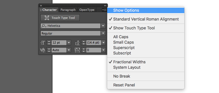
This shows you a bunch of other metrics which I’ll need to make a blog post at some point to explain. But the one we want is the stretched type indicator shown by the red arrow below.

Screen Shot 2017-06-30 at 2.38.53 PM

My “type sample” has not been stretched in any way and so 100% is indicated. But, if I stretch the type, you can see the percentage changes:

Screen Shot 2017-06-30 at 2.38.40 PM

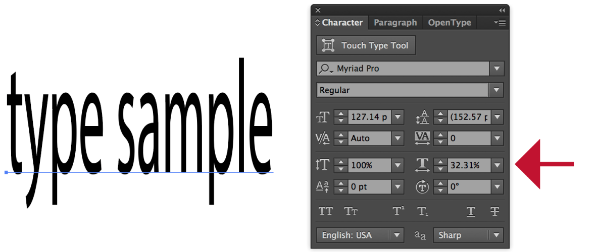
If I want to restore the type back to 100%, all I have to do is click the dropdown arrow next to the percentage and choose 100%.

That’s it – that’s how to fix type stretching in Adobe software. In Powerpoint, I believe they have set it up so you can’t actually stretch the type, but this isn’t true for images.

Image Stretching

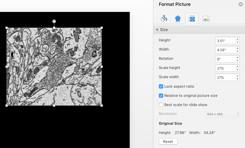
In Powerpoint (post 2016), it’s pretty easy to tell if an image has been stretched. If you open an image and have it selected you should see a “Picture Format” option appear on the top right. By clicking it, a panel swings out. The sizing icon gives you the options below and note in this image that the height and width have both been scaled to 27% indicating a correctly proportional image.

Screen Shot 2017-09-28 at 1.40.29 PM

However, if I stretch the image you can see that the scale height and width are different – indicating the distortion.

Screen Shot 2017-09-28 at 1.40.46 PM

I can fix this just by entering in the same percentage in both the height and width scale columns.

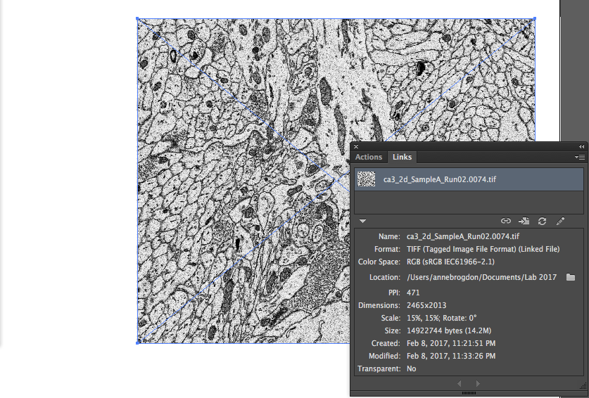
In Adobe Illustrator, this notation is a little harder to find. If you go up to “Window” -> “Links” it will open up a panel showing all of the images you have placed into Illustrator. If you select the image you want to check, you can see a long descriptive list of the attributes of the image displayed as below. Under “Scale”, you can see the height and width are the same indicating the image is not stretched.

Screen Shot 2017-09-28 at 4.05.14 PM

If I stretch the image disproportionately, you can see that the Scale now displays two different percentages indicating the stretch. Also the PPI is now showing two different values.

Screen Shot 2017-09-28 at 4.05.30 PM

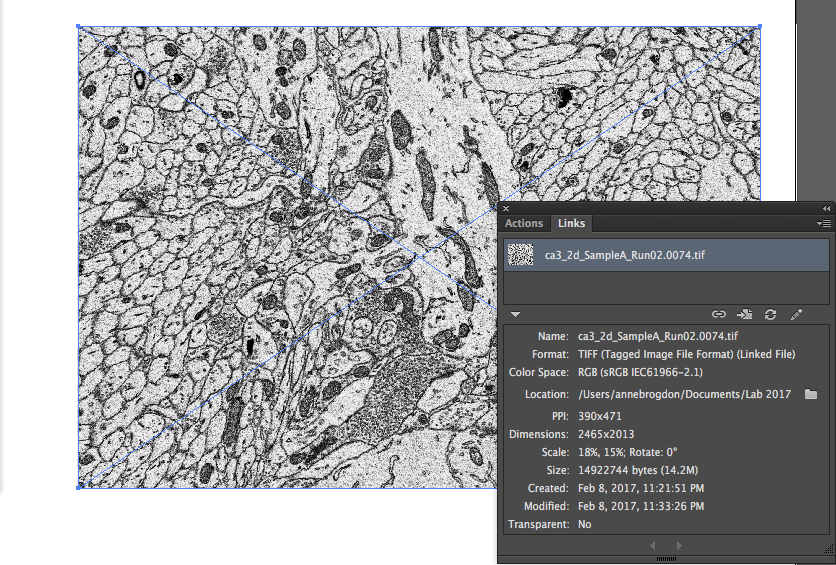
How to fix it? Unfortunately, Illustrator doesn’t give you the easy option of just correcting the image to the right percentage. If you go to”Object” -> “Transform” -> “Scale” you can alter the horizontal and vertical percentages in a non-uniform way, but you need to mathematically figure out the difference. I’d strongly recommend just re-placing the image to be sure you have the image accurately represented.

Now you know how to check your type and images for distortions!

Making your images colorblind-friendly just got a little easier.

Approximately 1 in 12 men and 1 in 200 women of the world are colorblind. While the advice of using a magenta/green color scheme as opposed to the red/green color scheme in scientific images is beginning to be widely distributed, I’ve recently been introduced to a tool that goes much farther to help us become better visual science communicators.

Vischeck is a website developed by two researchers at Stanford University that simulates how an image is viewed by individuals with three forms of colorblindness: Deuteranope, Protanope, and Tritanope vision. You can upload a jpg or png of your scientific image and see how it appears to individuals with these forms of vision. How cool is that?

To test it out, let’s see what happens with this image of Cho cells that I’ve immunostained and labeled with red, green, and blue channels in Fiji.

Screen Shot 2017-09-27 at 3.33.49 PM

In original image on the left you can clearly differentiate between the red and green channels, but on the right you can see how the distinction between these colors is completely removed. How wonderful that we can test our images in this way!

Just for kicks, I also inputted the Vizsi logo and the result is quite beautiful…

Screen Shot 2017-09-27 at 3.24.50 PM

Now the site does have a disclaimer and points out that their simulation isn’t perfect as display devices can show image color differently, however this is the best tool I’ve seen for testing this problem. And if nothing else, it illustrates how simple changes such as alterations in color value (the lightness/darkness of a color) can help everyone distinguish between the different colors in your images. Try it out!

A few other tools include WebAim’s color contrast checker in which you can input two color combinations and see if they have an appropriate contrast ratio for web viewing (4:5:1 or higher), and the I want to see like the colour blind extension available in Chrome. And lastly here are a few more tips for designers on color accessibility from Smashing Magazine, many of which can apply to scientific image design as well.

Links:
Vischeck: http://www.vischeck.com/
WebAim color checker: https://webaim.org/resources/contrastchecker/
Chrome extension: https://chrome.google.com/webstore/detail/i-want-to-see-like-the-co/jebeedfnielkcjlcokhiobodkjjpbjia?hl=en-GB
Smashing magazine tips: https://www.smashingmagazine.com/2016/06/improving-color-accessibility-for-color-blind-users/

Batch Processing – Make Photoshop do the work!

Last week I needed to open about 100 image files and simply crop them, all in the same manner. I was making a video panning through the z-axis of a set of 3D scanning electron microscopy images and just needed them to be focused in closer on more detail. Opening and closing 100 image files and cropping them was going to take time – so instead I decided to let Photoshop do the work for me and embraced batch processing!

How this works, is you create an action (like cropping an image or changing the image color mode from RGB to CMYK or something simple like that), apply it to a folder of files, and Photoshop magically performs that action on that entire folder – saving them under whatever naming system you desire. Thus my hour-long task was now just a five minute task. So worth it! Note that the action needs to be the exact same for each file. For instance, you can’t tell it to crop in a different areas of an image. But this works really well for mindless tasks like changing resolution from x to x, or just saving all the files under a new naming convention. Below is the process for creating an action and activating Batch processing – now get batching!

Step One: Create an Action

Go up to “Window” and Select “Actions”.

batch1

You’ll see a panel pop up with lots of options for pre-recorded actions, but you’re going to be making your own.

batch2

Select the “Create New Action” icon on the lower right.

batch3

Name it something you’ll remember and press record.

batch4

Now be careful – every move you make in Photoshop is being recorded – so now isn’t the time to try experimenting. You can tell you are recording because the action window will show a red dot.

batch5

So let’s get started! First we want to open up one of the images we want to edit. It works best if you go ahead and put together a folder full of the images you want to edit – make sure you have originals of these files in a safe place! Don’t edit originals. Here, I’ve created a folder of EM images and opened one in which I’m going to make the canvas size smaller. So I can go up and select canvas size…

batch6

And then make the setting which I want applied to all my images.

batch8

And you’ll note that under my action in the Actions panel, it shows that I want it to open a file and then apply this canvas size change.

batch9

Next I want to save my image using a standard convention.

batch10

And then I’ll close the image.

batch11

This is all I want this action to do. So I’m going to hit the square “Stop” button.

batch12

Now this action is ready for use!

Step Two: Get Batching!

I’m going to go up to “File” > “Automate” > “Batch”.

batch13

And a window pops up with seemingly lots of options. You’ll see the second left dropdown menu allows you to select the action you just made. Then you can select the source folder that has all of your images ready for editing.

batch14

And then on the right you just need to select your destination folder where Photoshop will output all of the newly edited images. Here you can also select a new document name if you like, or add any sort of extension to the name, like “edit” or a number.

batch15

And then hit ok and Photoshop will become a blinking mass of rapidly opening, editing, and closing files. And after a few minutes – depending on the number of images – voila! You’re done!


12 Quick Tips for Research Presentations

1. Don’t use bullet points – animate your statements

It is best to reduce the text on your slides to as little as possible. But sometimes you have to list essential information. Rather than simply putting up a wall of text immediately – animate your (abbreviated) statements to pop up point by point as you talk about them. Otherwise people will simply read the wall and ignore you. And as reading can be difficult with distraction, they won’t absorb what they read.

2. When arranging your slide – remember your audience

I can’t count the number of presentations I have attended where audience heads have blocked slide content. Depending on the room you are presenting in, it is likely that the bottom quarter of your slides will be obscured. Thus, do not place critical images or information here. Similarly, ensure that your text is legible from a distance. This is also dependent on what room you are presenting in. For instance, a lab journal club presentation in a small room can utilize smaller text than a ballroom presentation for 1,000+ attendees. And lastly, keep in mind that not only your slide title text needs to be legible, but also the numbers and title axes on your graphs, the scale bars on your immunos, and your figure citations.

3. Pay attention to your fonts and symbols

While we’re talking about type, use the same font at the same size for similar types of text boxes. For example, have one size for a title, another size for text boxes, but keep the font the same. If you need to specialize, there’s always bold and italics, but use them sparingly. In Microsoft Powerpoint, symbols can be found under the “Insert” tab.

4. Don’t use gradients, and pre-screen your colors

Use subdued colors that do not clash – yellow and dark blue is a well known color disaster, but also purple and orange, red and green, etc. Also, colors often display differently on a projected screen than on your monitor. Always find a projector and check your colors to make sure everything is distinct and legible a day or so before your presentation. If you want to use a dark background be sure that you can read the type easily. And don’t flip back and forth between dark and light backgrounds – this can stimulate eye fatigue in an audience.

5. Be careful with those immunos

When you show a single immunostain separated into several images with a different channel in each image, be sure to leave a gap between them so you can distinguish between them and easily compare them. If you place them directly next to one another it is difficult to tell where one image ends and the next begins and comparison becomes impossible. Also, be sure to label your channels. I need to be able to find out what green is from the slide in case I miss you saying it.

6. Don’t stretch your images or your type

I repeat, don’t stretch your images or your type! Always proportionally increase or decrease size (hold shift down as you re-size). It is obvious when items are stretched and it comes off as sketchy resulting in doubt of your work.

7. If you don’t talk about it, don’t show it

Don’t distract from your point by including additional information on a slide that you don’t discuss. You are the guide to understanding your research, you want the attention on you.

8. If you show math/equations, it has to be worth the loss of attention.

Highly dependent on your area of study and audience, you may or may not want to discuss math/equations. Of course if it is critical to your work, show it, but be sure to break it down.

9. Each slide should summarize a single significant point of information

This is easy to test in formulating your slide title. If you’ve got an “and” in there, rethink if you could break the slide into two.

10. Watch your margins

Don’t let important information get cut off. Sometimes projectors are not perfectly centered. Leave a margin of at least half an inch on all sides of your presentation slides.

11. Use animations sparingly

Animations attract attention, but only when used sparingly. Overuse can cause fatigue.

12. Don’t use animated slide transitions

They might have been fun in middle school, but in a scientific presentation they just add time and can trip you up as you’re speaking.

Let’s add to the list! What other helpful tips have you come across?

Reducing Your PDF Size

To submit your paper to a journal you will likely need to drastically reduce the size of your manuscript pdf – especially for the initial submission – but how do you do this without hurting the quality of your images?

A Quick Fix

For an initial submission, let’s try the easiest way first.

screen-shot-2017-02-23-at-4-58-57-pm

Open the file you wish to reduce in Adobe Acrobat Pro (this will not work with Adobe Reader).  Under File -> Save as Other -> Reduced Size PDF. Choose Retain Existing and pick a new file name. The new file will be the smallest Acrobat can shrink it without visually altering your digital image quality, however the file is possibly no longer at print resolution and you should always screen the file to make sure no odd image alterations took place.

Did that not reduce it enough? Or do you need it at print resolution for the final submission? Read on, traveler.

More Control with Adobe Acrobat

There are two ways to have more control over your pdf size. One is found in Adobe Acrobat and one in Adobe Illustrator. Let’s look at Adobe Acrobat first.

Under File -> Save as Other -> Optimized PDF.

This opens up the PDF Optimizer window.

screen-shot-2017-02-23-at-4-59-37-pm

Let’s click the “Audit Space Usage” button in the top right. This shows you where the majority of your file size is coming from. Predictably it will be from your images.

Under the Image Settings you see a lot of options for how to alter your Color, Grayscale, and Monochrome Images. The safest type of downsampling is called “bicubic downsampling” and it is probably preselected for you.

For print resolution, you want to not downsample below 300 ppi for any of these options. And you want to retain your existing compression. Note that publications will generally tell you the dpi/ppi they require. In some cases they will ask for the monochrome images not to be reduced below 1200. Look at the author guidelines of the journal you are submitting to in order to be sure of their requirements.

For getting that file size down to manageable levels, let’s choose 150 ppi and retain existing compression. This should reduce the file size, but you shouldn’t really notice a difference in image quality.

For getting that file size down as low as possible, let’s choose 72 ppi and retain existing compression. This many begin to erode your image quality depending on your images. Check through and see if it degrades the images too much for your liking.

For more tips on these other windows you can find more info here.

More Control with Adobe Illustrator

Go to File -> Save as -> PDF

Here you’ll first see a screen like so:

screen-shot-2017-02-23-at-3-20-55-pm

To reduce the size, select the checkbox above for “Optimize for Fast Web View” and uncheck the other boxes.

Next click the “Compression” tab on the left hand side of the window and these options will appear:

screen-shot-2017-02-23-at-3-21-16-pm

You’ll note these options are very similar to those for Optimizing your PDF in Acrobat. The same rules apply.

For print resolution on that final manuscript submission, you want to not downsample below 300 ppi for any of these options. Be sure to check the journal you are submitting to as they may stipulate these settings. In particular, they might request your monochrome bitmap images not dip below 1200 dpi/ppi.

For getting that file size down to manageable levels for the initial submission, let’s choose 150 ppi. This should reduce the file size, but you shouldn’t really notice a difference in image quality.

Still not small enough? For getting that file size down as low as possible, let’s choose 72 ppi. This many begin to erode your image quality depending on your images. Check through and see if it degrades the images too much for your liking.

Always choose Bicubic downsampling and ZIP compression.

Hopefully this helps! Let me know if you have specific concerns in the comments.